Atruvia
With the banking industry undergoing massive changes, Atruvia AG underwent an organisational and cultural transformation process, realigning from IT service provider to digitalisation partner within the cooperative FinanzGruppe.
Atruvia’s clients include around 820 credit unions and cooperative banks throughout Germany, the companies within the cooperative FinanzGruppe, and several companies in other industries.

Atruvia’s clients expect relevant digital products and personalised solutions. The brand’s DNA addresses today’s expectations by bringing together the worlds of collective thinking on one hand and pioneering financial technology on the other.
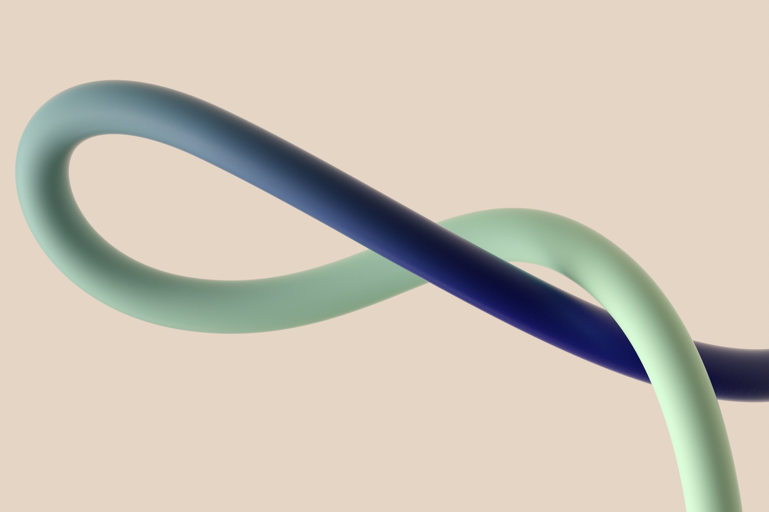
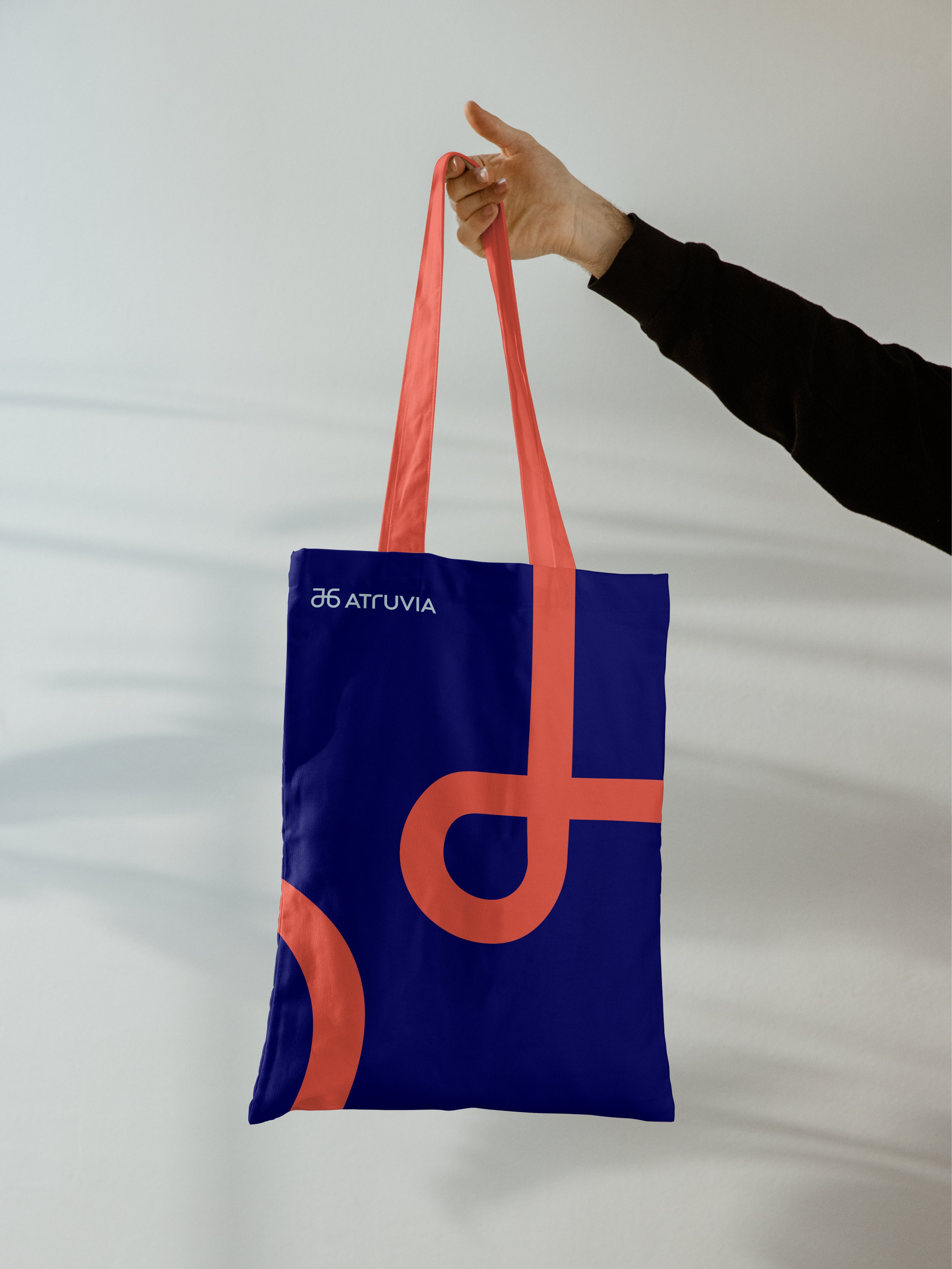
The overarching brand principle of connections can be found in the brand’s new name »Atruvia« and throughout the entire brand experience, creating a consistent and meaningful identity.


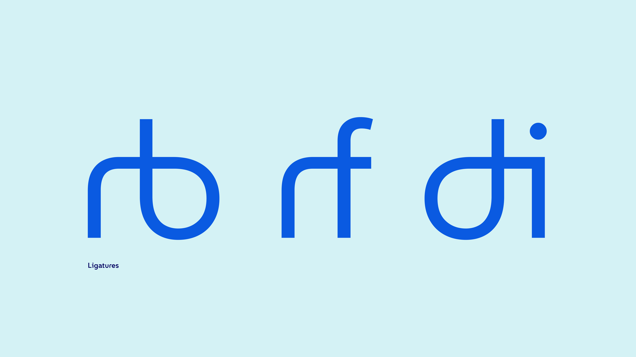
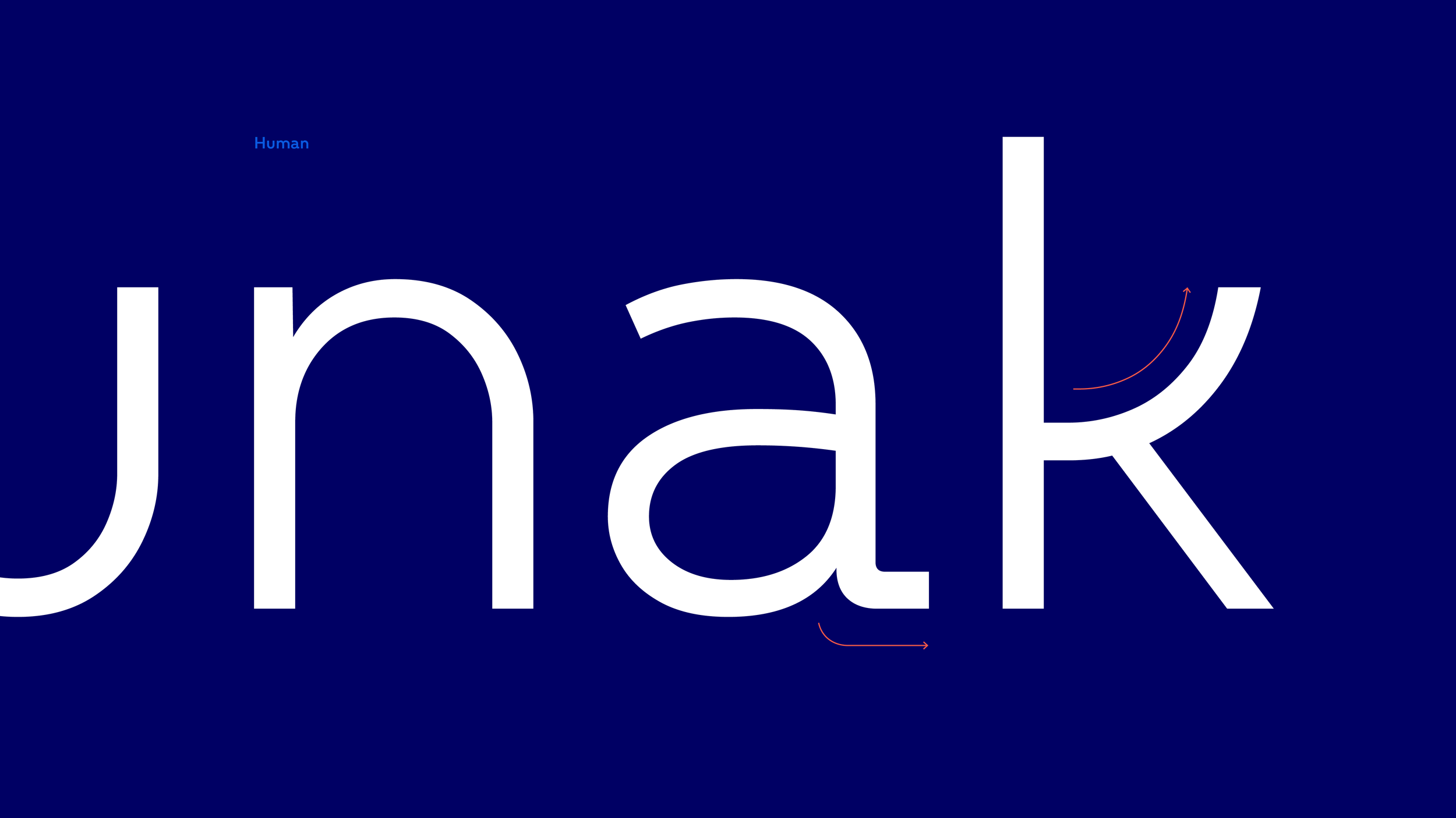
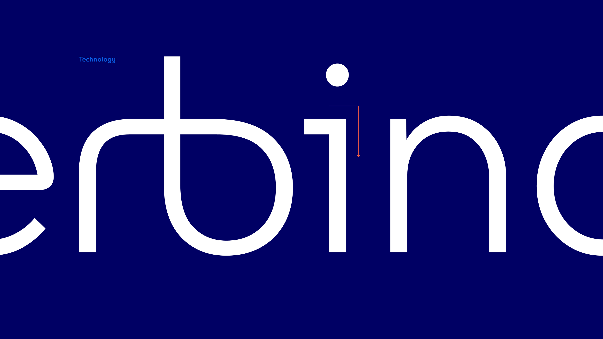
The »VIA Line« is the primary design element used to connect the different design components with each other. Soft lines and angular details represent both sides of the brand: people and technology. A custom typeface, the »VIA Type« has been developed incorporating these details. The typeface features custom ligatures based on the logo, further strengthening the overarching idea of connections.


created at
KMS TEAM
designed by
Patrick Carlet
Marina Becker
Aurelian Hallhuber
Arne Vogt
Robert Lumer
Hendrik Weber
Frederik Mair
additional thanks
Jette Bourne
Christian Schmidt
Oliver Techel
Someform Studio
VIM Group
awarded with
Red Dot
iF Design Award
Corporate Design Preis
German Brand Award